To understand the present of international football, one must traverse the winding road of the past which led us here. Clearly, the most important part of this metaphorical road is what the road is wearing. Style is a product of the times, and it appears that some of the times have been quite grim indeed. In international football, we stand on the shoulders of giants. Unfortunately, these giants often looked like patriotic trannies.
The first stop on our World Cup Uni history tour is right in the good ol' US of A, where a nation with no shortage of style in the 1990's fell on some hard times.
United States(1994). No more poignant example exists of how misled a nation once was (even including you, Soviet Union). In true manifest destiny style, the US team of 1994 set out on a journey to mercilessly conquer each and every set of eyes in the world and then swiftly crap on them. You know when Americans find shirts that make them look even more like Americans than Afgahni cartoons of Americans, you've done something profoundly correct. Let's explore:
HOME:
Hosting the World Cup for the first time ever in a controversial decision by FIFA, the US decided to use their kits during the host year as a vehicle to throw out an emphatic 'F you' to all of the international haters. Rocking the 'been sitting outside on a rusty dryer behind a meth lab for 5 years' fade motif on the home jersey, the US distanced itself from the harmful stereotype of being a world economic leader and instead decided to go with a decidedly more homely approach which resulted in looking like a dessicated, yet patriotic, Wal-Mart jean-turd. These colors don't run. There's barely any pigment left, anyways.
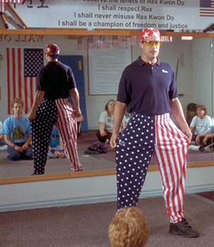
AWAY:
When you're selecting a new jersey design which will be presented on the world stage at the biggest and most important event in all of sports, what must you always ask yourself?
If you answered 'Would this design look cool in a funhouse mirror?' or 'Would it make our country look like disciples of Rex Kwon Do?,' you're correct.
Cashing in on the fact that not one person in the world knows that the American flag has both stars AND stripes (I know. Hard to unsee, isn't it?), the designers of this little piece of flair just couldn't stop themselves. In an office bet which also resulted in an intern getting a swirlie, the lead designer was forced to don on a pair of FatalVision goggles while drawing the stripes, leading to a jersey which looks suspiciously like upturned lasagna. Unfortunately, however, the cost of hosting the Cup on home soil finally took its toll as budget cuts dictated that the twizzler motif would not able to grace the sleeves. Tragic, really.
No comments:
Post a Comment